Indoor Digital Signage: Best Practices for Design and Layout
Indoor Digital Signage: Best Practices for Design and Layout.In the modern era of digital transformation, indoor digital signage has become a crucial component of effective communication and brand messaging. From retail stores to corporate offices, hospitals to educational institutions, digital signs play a pivotal role in engaging audiences, directing traffic, and enhancing the overall environmental experience. However, designing and laying out these signs is not a task to be taken lightly. It requires careful consideration of several factors to ensure optimal impact and usability.

1. Understand the Purpose
Before embarking on the design process, it's essential to have a clear understanding of the purpose of the digital signage. Is it meant to inform, direct, advertise, or entertain? Each purpose will dictate different design elements and content strategies. For instance, a wayfinding sign in a hospital will prioritize clarity and simplicity, while a promotional display in a retail store might focus on visual appeal and dynamism.
2. Consider the Audience
Knowing your audience is key to creating effective digital signage. Consider their demographics, psychographics, and behavioral patterns. What information do they need? How do they prefer to receive it? Answers to these questions will guide decisions about content, design style, and even the technical aspects of the signage, such as screen size and resolution.
3. Embrace Simplicity
When it comes to digital signage, less is often more. Avoid the temptation to overload your screens with too much information or overly complex designs. A clean, uncluttered layout with clear, concise messaging is more likely to capture attention and convey your message effectively. Use white space, typography, and color schemes strategically to enhance readability and visual appeal.
4. Use Dynamic Content
One of the main advantages of digital signage over traditional print signs is the ability to display dynamic content. Take advantage of this by incorporating videos, animations, and real-time updates into your designs. Not only do these elements add visual interest, but they also allow for more interactive and engaging experiences. Just be sure to maintain a balance between dynamism and readability.
5. Ensure Readability
No matter how visually appealing your digital signage is, if it's not readable, it's not effective. Choose fonts that are large enough to be seen from a distance and that have good legibility, even when viewed at an angle. Consider the viewing distance and angle of your audience when determining font size and style. Additionally, use high-contrast color combinations to further enhance readability.
6. Integrate with the Environment
Indoor digital signage should complement, not compete with, its surrounding environment. Take into account the ambient lighting, color palette, and architectural features of the space when designing your signs. This not only ensures visual harmony but also helps the signage to stand out in a positive way, rather than being a distracting element.
7. Consider Accessibility
Accessibility is a crucial aspect of any design, and digital signage is no exception. Ensure that your signs are compliant with accessibility standards, such as providing adequate color contrast and using clear, easy-to-understand language. If possible, consider incorporating assistive technologies, such as screen readers or audio descriptions, to accommodate a wider range of audiences.
8. Test and Iterate
Finally, don't forget to test your digital signage designs before implementing them. This could involve conducting user tests, gathering feedback from stakeholders, or simply observing how people interact with the signs in a real-world setting. Use this feedback to iterate and improve your designs, ensuring that they meet the needs and expectations of your audience.
In conclusion, designing and laying out indoor digital signage is a multifaceted task that requires careful consideration of purpose, audience, simplicity, dynamism, readability, environmental integration, accessibility, and testing. By following these best practices, you can create digital signage that not only looks great but also effectively communicates your message and enhances the overall experience of your indoor space.
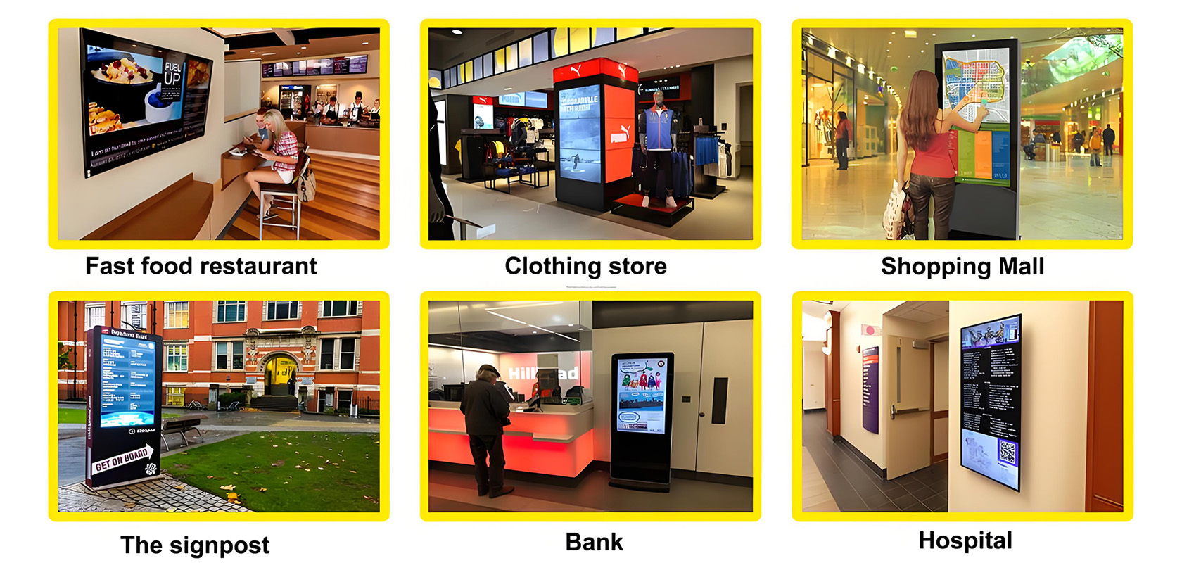
Application scenarios of digital signage


