How to Design Eye-Catching Digital Signage Layouts
How to Design Eye-Catching Digital Signage Layouts.In today's fast-paced digital world, capturing and retaining the attention of your audience is a challenge. Digital signage has become a powerful tool for businesses to communicate their message effectively, but it's crucial to design layouts that are not only visually appealing but also engaging and informative. A well-designed digital signage layout can significantly enhance the overall impact of your content, driving customer engagement and boosting brand awareness. This article will delve into the key principles and strategies for designing eye-catching digital signage layouts.

1. Understand Your Audience
The first step in designing an effective digital signage layout is to understand your target audience. Who are they? What are their interests? What motivates them? By answering these questions, you can tailor your design to resonate with your viewers, making it more likely that they will engage with your content.
Demographics: Consider age, gender, and income level. For instance, younger audiences might prefer more vibrant colors and dynamic animations, while older audiences might appreciate a simpler, more readable design.
Psychographics: Look into their interests, values, and lifestyle. Are they tech-savvy? Do they prefer visual or textual content? Understanding these aspects will help you create content that speaks directly to them.
Behavioral Patterns: Analyze how your audience interacts with digital signage. Are they usually in a hurry, or do they have time to linger? This will influence the complexity and length of your content.
2. Keep It Simple and Clutter-Free
Simplicity is key when designing digital signage layouts. A cluttered screen can overwhelm your audience, causing them to tune out. Ensure that your design is clean, uncluttered, and easy to navigate.
Limit the Number of Elements: Stick to a few key elements that convey your message effectively. Too many graphics, animations, or text boxes can distract from your main message.
Use White Space: Don’t be afraid of white space. It helps to balance your design and makes it easier for the eye to process information.
Clear Hierarchy: Establish a clear visual hierarchy that guides the viewer’s eye through the content. Use size, color, and contrast to emphasize important information.
3. Choose the Right Colors
Colors play a vital role in attracting attention and setting the tone of your digital signage. Use them strategically to enhance your message and evoke the desired emotional response.
Brand Consistency: Ensure that your color scheme aligns with your brand identity. Consistent use of colors helps to reinforce brand recognition.
Contrast and Readability: Use high-contrast colors to make text and graphics stand out. This is particularly important for outdoor digital signage, where readability can be affected by sunlight.
Emotional Appeal: Colors can evoke specific emotions. For example, blue is often associated with trust and calmness, while red can create a sense of urgency or excitement. Choose colors that align with the mood and message of your content.
4. Use High-Quality Visuals
Visuals are a powerful way to grab attention and communicate your message quickly. Use high-quality images, videos, and animations to make your digital signage stand out.
High-Resolution Images: Ensure that all images are high-resolution to maintain clarity on any screen size. Blurry or pixelated images can detract from your professional image.
Relevant Visuals: Choose visuals that are relevant to your message. Generic stock images might not resonate with your audience as much as custom visuals that reflect your brand and message.
Movement and Animation: Use animations and videos sparingly to add dynamism to your layout. However, be cautious not to overdo it, as excessive movement can be distracting.
5. Optimize Text for Readability
Text is a crucial element in digital signage, but it can easily become illegible if not designed properly. Follow these tips to ensure that your text is easy to read and understand.
Font Selection: Choose fonts that are clean, legible, and scalable. Sans-serif fonts are generally easier to read at smaller sizes and from a distance.
Font Size: Ensure that text is large enough to be read from the expected viewing distance. A general rule of thumb is to use a font size that is at least 1/10 of the screen height for comfortable readability.
Contrast and Color: Use high-contrast color combinations for text and background to ensure readability. Dark text on a light background or vice versa is usually the most effective.
Concise Messaging: Keep your text short and to the point. People tend to scan digital signage rather than read it thoroughly, so make sure your message is clear and concise.
6. Incorporate Interactive Elements
Interactive digital signage can significantly enhance user engagement and make your content more memorable. Consider incorporating touchscreens, QR codes, or other interactive elements to encourage viewer participation.
Touchscreens: Allow users to interact directly with your content through touchscreens. This can be particularly effective for wayfinding, product demonstrations, or surveys.
QR Codes: Use QR codes to link to additional online content, such as videos, promotions, or social media pages. This encourages viewers to engage further with your brand.
Gestures and Motion Sensors: Utilize motion sensors or gesture-based interactions to create an immersive experience. This can be particularly engaging for younger audiences.
7. Consider Placement and Context
The placement and context of your digital signage play a crucial role in its effectiveness. Ensure that your layout is tailored to the specific environment and purpose.
Viewing Distance and Angle: Design your layout considering the expected viewing distance and angle. For instance, outdoor digital signage might need larger text and graphics to be visible from a greater distance.
Environmental Factors: Take into account factors such as lighting, noise, and distractions in the environment. A brightly lit room might require higher contrast and brighter colors to attract attention.
Purpose and Goal: Align your design with the purpose of the digital signage. Is it meant to inform, entertain, or promote? Your layout should reflect the intended goal.
8. Test and Iterate
Finally, it's essential to test your digital signage layout before deploying it. Gather feedback from your target audience and make necessary adjustments based on their response.
A/B Testing: Create multiple versions of your layout and test them to see which one performs better. This can help you identify the most effective design elements.
User Feedback: Collect feedback from viewers through surveys, interviews, or on-site observations. This will give you valuable insights into how your audience perceives and interacts with your digital signage.
Continuous Improvement: Digital signage is a dynamic medium, so don't be afraid to make changes based on performance data and user feedback. Continuously refine your layout to improve its effectiveness.
Designing eye-catching digital signage layouts requires a thorough understanding of your audience, careful attention to design principles, and a strategic approach to content and interactivity. By following the tips outlined in this article, you can create digital signage that not only captures attention but also engages and informs your audience effectively. Remember to keep your design simple, use high-quality visuals, optimize text for readability, and incorporate interactive elements to enhance user engagement. Continuously test and iterate based on user feedback to ensure that your digital signage remains relevant and impactful. With these strategies in place, you'll be well-equipped to create digital signage that stands out in today's crowded digital landscape.
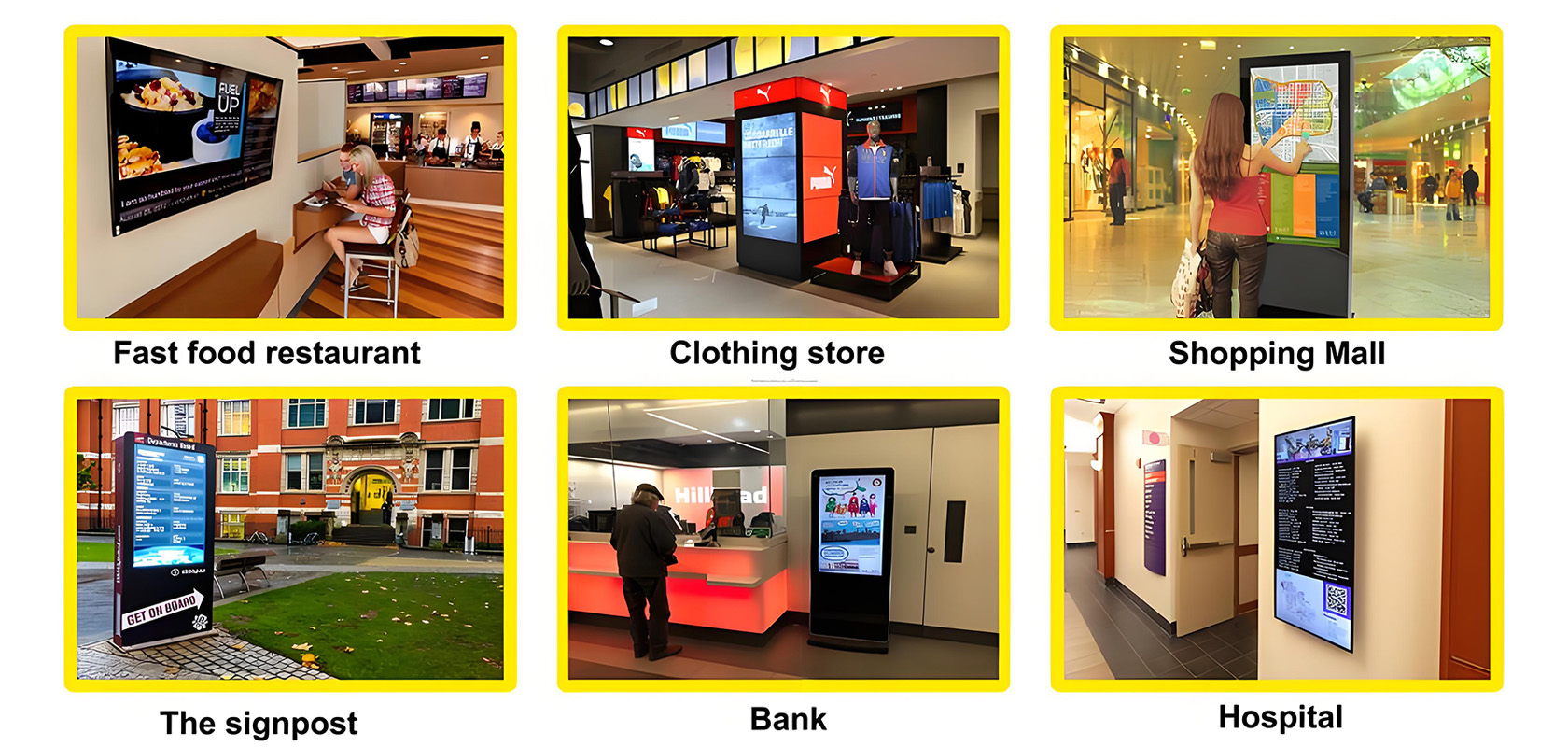
Application scenarios of digital signage


