How to Design Eye-Catching Digital Signage Content
How to Design Eye-Catching Digital Signage Content.In today's fast-paced world, digital signage has become an indispensable tool for businesses to communicate with their audience effectively. Whether it's in a retail store, a corporate office, a restaurant, or a public space, digital signs capture attention and convey information in a dynamic and engaging way. However, creating content that stands out and achieves the desired impact is an art form that requires careful consideration and creativity. This article delves into the nuances of designing eye-catching digital signage content, offering practical insights and strategies to help you craft compelling visuals that resonate with your viewers.

Understanding Your Audience
One of the foundational aspects of designing effective digital signage is knowing your audience. Who are they? What are their interests and preferences? Understanding demographic details such as age, gender, and cultural background can significantly influence your content design. For instance, younger audiences might be more responsive to vibrant colors and interactive elements, while older demographics might prefer clearer, less cluttered layouts.
Moreover, consider the context in which your digital signage will be viewed. Is it in a busy shopping mall where people are constantly on the move, or in a quiet waiting area where they have more time to absorb information? Tailor your content's complexity, pace, and visual style to suit the environment and the audience's likely state of mind.
The Power of Visual Hierarchy
Visual hierarchy refers to the arrangement of elements in a way that guides the viewer's eye through the content. It's crucial for ensuring that the most important information stands out and is easily digestible. You can achieve this by utilizing size, color, contrast, and positioning.
Size: Larger elements naturally draw attention first. Use this to your advantage by making key messages or calls-to-action (CTAs) the largest elements on the screen.
Color: Bright, contrasting colors can make elements pop, while muted tones can help create a subtle background. Be mindful of color psychology; for example, red can signify urgency or excitement, while blue conveys trust and calmness.
Contrast: High contrast between text and background ensures readability. Use it to highlight important information and create depth.
Positioning: Place critical information in areas where the eye naturally falls, such as the top-left corner or the center of the screen.
By thoughtfully organizing your content, you can direct viewers' attention and ensure that your message is communicated efficiently.
Engaging with Multimedia
Digital signage offers the unique advantage of incorporating multimedia elements—videos, animations, and sound—to create immersive experiences. Here's how to leverage these:
Video Content: Use high-quality videos that are relevant to your message. Short clips or looping videos can captivate audiences more effectively than static images. Ensure they are optimized for quick loading times to avoid lag.
Animations: Subtle animations can bring your content to life without overwhelming the viewer. Use them sparingly to highlight key points, transitions, or to add a touch of dynamism to your slides.
Sound: If appropriate for your setting, consider adding background music or sound effects. Make sure they complement the visuals and aren't distracting. In some cases, silence can be equally powerful, allowing the visuals to speak for themselves.
Remember, the goal is to create a harmonious blend of multimedia elements that enhance the overall experience, not overwhelm it.
Content Clarity and Brevity
In the realm of digital signage, less is often more. Viewers are likely to scan your content rather than read it thoroughly, especially in high-traffic areas. Therefore, it's essential to keep your message clear and concise.
Use Bullet Points: Break down information into short, digestible bullet points. This makes it easier for viewers to quickly grasp the main ideas.
Avoid Jargon: Use simple language that your target audience can understand. Industry-specific jargon or overly complex terms may confuse and alienate viewers.
Focus on Key Messages: Prioritize your content. Determine what the most critical information is and ensure it's prominently displayed. Secondary details can be included but should not detract from the primary message.
Clarity in your content ensures that your audience can quickly understand your message, increasing the effectiveness of your digital signage.
Interactive Elements
Interactivity is a game-changer in digital signage. It engages viewers more deeply by allowing them to interact with the content, making it memorable and impactful. Depending on your technology, you can incorporate touchscreens, QR codes, or motion sensors to create interactive experiences.
Touchscreens: Use them for surveys, product searches, or even games. Make sure the interface is intuitive and responsive.
QR Codes: These can link to additional information or online resources. Encourage viewers to scan them for exclusive offers or more detailed content.
Motion Sensors: Ideal for installations that react to the presence of people, such as changing displays or triggering animations.
Interactivity not only makes your content more engaging but also provides valuable data on viewer interactions, which can inform future content strategies.
Consistency in Branding
Your digital signage should reflect your brand's identity consistently. Use your brand's color palette, fonts, and imagery to create a cohesive look and feel. This reinforces brand recognition and fosters trust with your audience.
Color Scheme: Stick to your brand's color palette to maintain visual consistency.
Typography: Use brand-approved fonts for all text elements. Consistency in typography enhances readability and brand recognition.
Imagery: Incorporate images that align with your brand's style and messaging. High-quality, relevant visuals can significantly enhance the appeal of your content.
Consistency helps your digital signage blend seamlessly into your overall marketing strategy, reinforcing your brand message across all touchpoints.
Regular Updates and Fresh Content
Static content can quickly become outdated and lose its appeal. Regularly updating your digital signage keeps it fresh and engaging. Plan a content schedule that aligns with your business goals and audience preferences.
Seasonal Content: Adjust your content to reflect current seasons, holidays, or events. This keeps your signage relevant and timely.
Promotional Campaigns: Highlight new products, services, or promotions. Use digital signage to create a sense of urgency and drive sales.
Feedback Loop: Monitor viewer engagement and use the insights to refine your content strategy. If certain types of content perform better, incorporate more of them into your rotation.
By keeping your content fresh and relevant, you ensure that your digital signage remains a powerful communication tool.
Designing for Accessibility
Lastly, don't forget about accessibility. Ensuring that your digital signage is accessible to all viewers, including those with disabilities, is not just a good practice but often a legal requirement.
Readability: Use high-contrast text and large font sizes to make content readable for individuals with visual impairments.
Alt Text for Images: Incorporate descriptive alt text for images, benefiting viewers who use screen readers.
Closed Captions: Provide closed captions for video content to assist those with hearing impairments.
Simple Navigation: Design interfaces that are easy to navigate, even for those with motor impairments.
Making your digital signage accessible ensures that your message reaches the widest possible audience, enhancing its overall impact.
Creating eye-catching digital signage content is a blend of art and science. It requires a deep understanding of your audience, thoughtful design choices, and strategic use of multimedia elements. By focusing on clarity, consistency, interactivity, and accessibility, you can craft content that not only captures attention but also effectively communicates your message. Remember, the key is to balance visual appeal with functionality, ensuring that your digital signage is both engaging and informative. With these principles in mind, you'll be well-equipped to design digital signage content that stands out and achieves your communication goals.
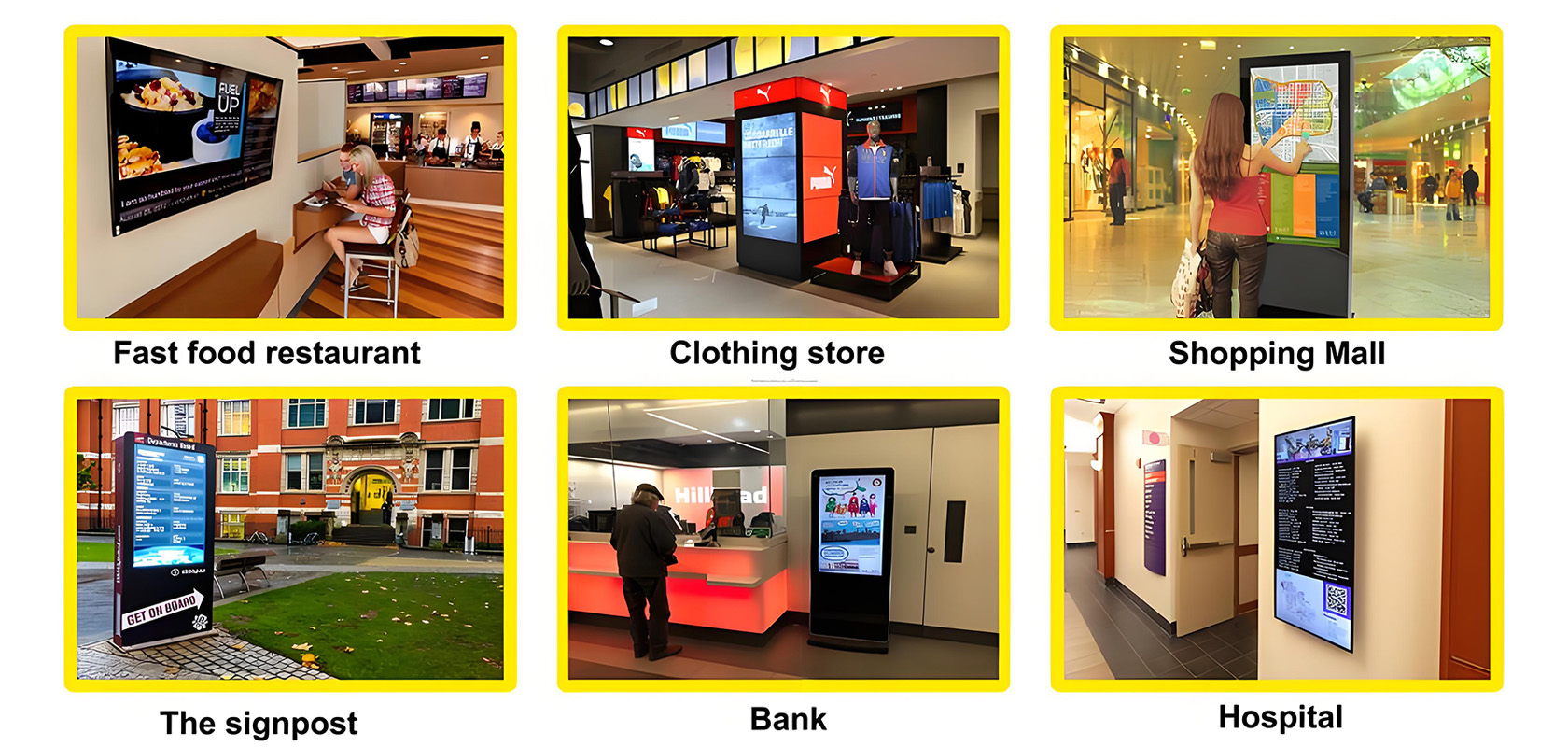
Application scenarios of digital signage


