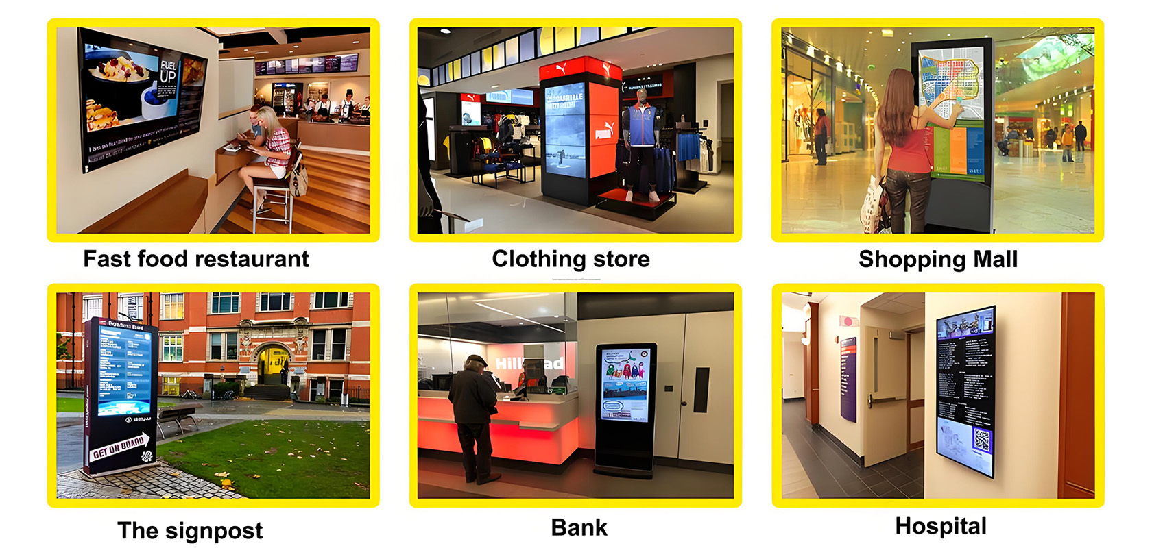
I believe many people are familiar with digital signage. Digital signage and traditional light box advertising has a big difference. It mainly uses liquid crystal display to show advertisements in front of consumers more vividly through video, pictures and sound. The advertising function is far higher than the light box advertising several levels.
Many customers struggle to keep their content accessible. Of course, while most common digital content doesn't fit, it's easy to fix. The use of different functions on different occasions can enhance the audience participation of customers. Here, we describe four common mistakes that scholars make to get digital signage content right.

1. the content is monotonous, bad impression.
Monotonous content destroys the entire deployment, both the run-time and the discriminator screen. Digital signs are imaginary to attract attention and support participation. If the content is on a white set with black text, it may be useless.
While some people may not be able to do anything with the "afternoon, conference room" message, it makes the style of the message more interesting. Wallpaper is a surefire way to attract an audience. The online library is a useful resource to beautify and enhance news information. Animations also easily transform slides from boring to new and changing. Digital tag customers also create short animated video clips that turn longer messages into news stories.
2. The material is not novel enough.
Have to say that the material is not novel enough is a common problem of many companies, which involves the copywriting planning plate of enterprises. The digital signs have been running a campaign for several months. No doubt it will be overlooked. If the company is in an outdoor location, we need to remember not to make the audience feel "crazy". Viewers want to see fresh content on a consistent basis. Even if there is no new news information, the visual appearance of the transfer can give people a different feeling. Speed transfer of color elements and static visual graphics essence original miracle. Some fusion and application essentials automatically order from digital signature producers to automatically innovate content.
3. Excessive information and insufficient emphasis
If you display a lunch menu, a presentation, and interesting news information at the same time, it may take a second for the consumer to digest it all.
Lack of emphasis can lead to confusion. Digital signs are meant to simplify communication, not confuse it. If the digital tag masks all advertised topics, the tag operator will not properly manipulate the media.
4. Long and complicated.
As we all know, "simplicity is the soul of AI". Audiences want short, digestible news. Such a long text needs to be rejected. If the viewer doesn't get the message for a few seconds, some text definitely needs to be deleted.
Remember, this is a number sign, not a writing contest. Try to keep the information in two short sentences. If you cannot restrict text, divide the information into multiple digital signage scenarios.
Don't limit the effectiveness of digital content because of these silly mistakes. These are easy to improve. Viewers need to keep the content fresh and relevant to make digital signage more useful.

Current article link: https://www.lcdkiosk.com/news/46.html

Tel
