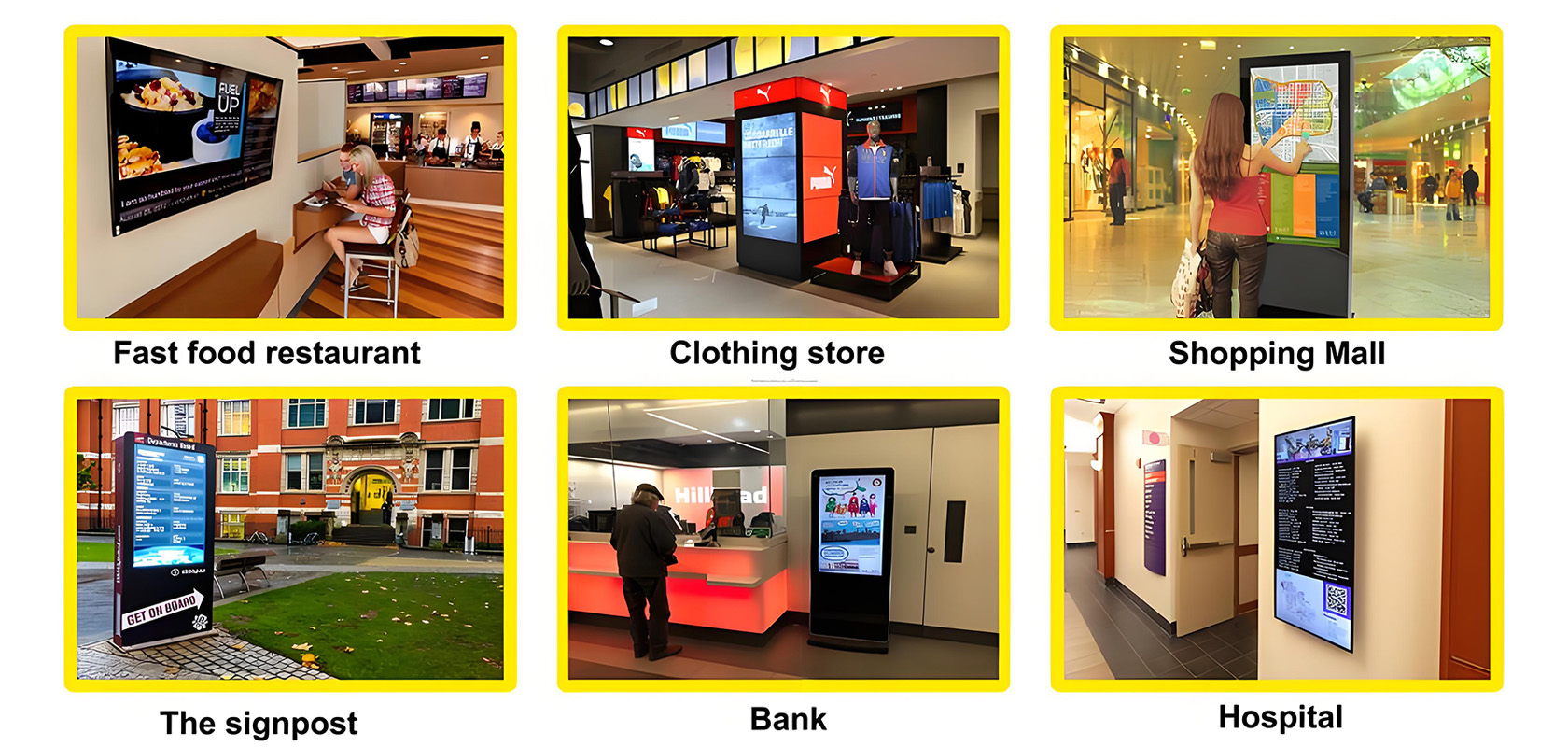
How to Design Eye-Catching Digital Signage.Digital signage has revolutionized the way businesses communicate with their audiences. From vibrant retail displays to informative corporate lobbies, digital signs have become an integral part of modern marketing and communication strategies. However, designing effective digital signage that captures and retains viewers' attention is an art form that blends creativity with strategic planning. In this article, we'll explore the key elements and best practices for designing eye-catching digital signage.

Understand Your Audience
Before diving into the design process, it's crucial to have a deep understanding of your target audience. Knowing who you are designing for will inform every aspect of your signage, from content to style.
Demographics and Psychographics
Consider the age, gender, income level, education, and interests of your audience. Are they tech-savvy millennials or busy professionals? Tailor your design to resonate with their preferences and behaviors. For instance, younger demographics may prefer more dynamic and colorful designs, while older audiences might appreciate a simpler, cleaner layout.
Contextual Relevance
Think about where your digital signage will be located. Is it in a bustling shopping mall, a quiet office building, or a busy airport? The environmental context will influence design choices such as font size, color scheme, and the amount of text versus visuals. For example, signs in high-traffic areas should be designed to be easily readable from a distance and convey information quickly.
Keep It Simple and Clear
One of the most common mistakes in digital signage design is overloading the screen with too much information. A cluttered display can overwhelm viewers and make it difficult for them to absorb any information at all.
Minimalist Design
Embrace minimalist design principles by focusing on one key message at a time. Use plenty of white space to create a clean, uncluttered look. This approach not only makes your content more readable but also draws attention to the most important elements on the screen.
Use of Contrast
High contrast between text and background ensures that your message stands out. Dark text on a light background or vice versa is generally the easiest to read. Be mindful of color choices; certain color combinations can be hard on the eyes or convey unintended emotions.
Engage with Visuals
Visuals are a powerful tool in digital signage. High-quality images, videos, and animations can grab attention and convey information more effectively than text alone.
High-Quality Images
Use high-resolution images that are relevant to your message. Blurry or pixelated images can give a sense of unprofessionalism and detract from your overall message. If you're using photos, make sure they are well-lit and in focus.
Video and Animation
Incorporate movement to capture attention. Short video clips or animations can be highly engaging, but use them sparingly to avoid overwhelming the viewer. A good rule of thumb is to keep any movement confined to a specific area of the screen to maintain focus on the primary message.
Strategic Use of Color
Color plays a crucial role in setting the tone and mood of your digital signage. It can also be used to guide viewers' attention and evoke emotional responses.
Brand Consistency
Use colors that align with your brand's identity. Consistent use of brand colors across all marketing materials, including digital signage, reinforces brand recognition and recall.
Color Psychology
Be aware of the psychological impact of different colors. For example, red can convey excitement or urgency, while blue is often associated with trust and professionalism. Use colors strategically to evoke the desired emotional response and reinforce your message.
Font and Readability
Choosing the right font is essential for ensuring that your message is easily readable and professionally presented.
Simple and Legible Fonts
Stick to simple, sans-serif fonts like Arial, Helvetica, or Verdana for body text. These fonts are easy to read on digital screens and from a distance. Avoid overly decorative fonts, as they can be distracting and difficult to read.
Font Size and Hierarchy
Make sure your font size is large enough to be read from the farthest viewing distance. Use font hierarchy to differentiate headings, subheadings, and body text. This not only makes your content more organized but also helps viewers quickly scan and absorb information.
Content Strategy
Content is king when it comes to digital signage. A well-designed display with compelling content can significantly enhance viewer engagement.
Concise and Relevant Messaging
Keep your messaging concise and to the point. Viewers typically have short attention spans, so get straight to the point. Make sure your content is relevant to the audience and the context in which it is being viewed.
Dynamic Content
Take advantage of digital signage's ability to display dynamic content. Use real-time data feeds, social media integrations, or interactive elements to keep your content fresh and engaging. Dynamic content not only keeps viewers coming back for more but also allows you to tailor your message based on current events or specific times of day.
Interactivity
Interactive digital signage can significantly boost engagement by allowing viewers to connect with your content in a meaningful way.
Touch Screens
If your budget and location permit, consider using touch screens. This allows viewers to navigate through content at their own pace and access more detailed information if they choose.
QR Codes
Incorporate QR codes that viewers can scan with their smartphones to access additional content, such as product information, special offers, or interactive experiences.
Regular Updates
Digital signage should not be a set-it-and-forget-it medium. Regularly updating your content keeps it relevant and engaging.
Seasonal and Event-Based Updates
Change your content based on seasons, holidays, or special events. For example, a retail store might showcase summer fashion trends in the warmer months and holiday gift ideas during the winter.
Fresh Content
Keep your content fresh and up-to-date. Old or outdated information can make your brand appear neglectful or unprofessional. Regularly review and update your content to ensure it remains relevant and engaging.
Conclusion
Designing eye-catching digital signage requires a blend of creativity, strategic planning, and technical know-how. By understanding your audience, keeping your design simple and clear, engaging with visuals, using color strategically, choosing the right fonts, developing a strong content strategy, incorporating interactivity, and regularly updating your content, you can create digital signage that not only captures attention but also effectively communicates your message.
Digital signage is more than just a tool for displaying information; it's a powerful medium for engaging with your audience and enhancing their overall experience with your brand. By following the best practices outlined in this article, you can create impactful digital signage that stands out from the crowd and achieves your communication goals.
Current article link: https://www.lcdkiosk.com/news/359.html

Tel
