How to Optimize Digital Signage for Mobile Viewers
How to Optimize Digital Signage for Mobile Viewers.Digital signage has revolutionized the way businesses communicate with their audiences, offering dynamic, engaging, and real-time content that can be updated at a moment's notice. However, as mobile device usage continues to soar, it's becoming increasingly crucial for digital signage to be optimized not just for stationary viewers but also for those on the go. In this article, we will explore the strategies and best practices for optimizing digital signage for mobile viewers, ensuring that your message reaches and resonates with your entire audience, regardless of how they are consuming it.

Understanding the Mobile Viewer
Before diving into optimization techniques, it's essential to understand the behavior and preferences of mobile viewers. Mobile users are often in transit, have shorter attention spans, and interact with their devices in different environments—from bustling streets to quiet cafes. This necessitates an approach that is:
Concise: Mobile viewers are less likely to engage with lengthy content. Messages should be clear, brief, and to the point.
Visually Impactful: With smaller screens, visual elements must be eye-catching and easily digestible.
Responsive: Content should adapt seamlessly to various screen sizes and orientations.
Location-Aware: Leveraging location-based services can enhance relevance and engagement.
Key Optimization Strategies
1. Design for Mobile-First
In the era of mobile dominance, designing with mobile viewers in mind should be a priority. This doesn't mean simply shrinking your desktop content to fit a smaller screen. Instead, it involves creating content specifically tailored for mobile:
Simplified Layouts: Use clean, uncluttered designs with ample whitespace to make content more readable on small screens.
Larger Fonts and Buttons: Ensure text and interactive elements are large enough to be easily readable and tappable.
Vertical Orientation: Many mobile users hold their devices vertically. Design your content to look good in portrait mode, too.
Quick Load Times: Mobile users expect fast load times. Optimize images and media for web to reduce loading times.
2. Use High-Contrast Visuals
Mobile screens are often viewed in diverse lighting conditions, from bright sunlight to dimly lit rooms. High-contrast visuals ensure that your content remains visible and engaging:
Bold Colors: Use contrasting colors for text and background to make content pop.
Dark Mode Options: Providing a dark mode can enhance readability in bright environments and save battery life.
Dynamic Brightness Adjustments: If possible, use sensors to adjust screen brightness based on ambient light.
3. Create Concise, Compelling Content
Given the limited attention span of mobile users, your content must make an immediate impact:
Short, Snappy Headlines: Capture attention with concise, intriguing headlines.
Bullet Points and Summaries: Break down information into easily digestible chunks.
Visual Hierarchy: Use design principles to guide users' attention to key information first.
Regular Updates: Keep content fresh and relevant to encourage repeat views.
4. Leverage Interactive Elements
Mobile devices offer unique interactivity that can enhance user engagement:
Touch Interactivity: Design content that invites touch, such as swiping through galleries or tapping for more information.
QR Codes: Include QR codes that mobile users can scan for additional content or to direct them to your website.
NFC Technology: Near Field Communication (NFC) can be used for contactless interactions, such as sharing content or collecting user data.
Gamification: Simple games or quizzes can make the experience more engaging and memorable.
5. Optimize for Speed and Performance
Mobile users are impatient when it comes to load times. Slow-loading content can lead to high bounce rates:
Compressed Media: Use compressed images and videos to reduce load times without sacrificing quality.
Efficient Coding: Utilize modern web standards like HTML5 and CSS3 for faster rendering.
Caching: Implement caching strategies to store frequently accessed data, speeding up subsequent visits.
Progressive Web Apps (PWAs): Consider developing your digital signage as a PWA for a more app-like experience with better performance.
6. Implement Responsive Design
Responsive design ensures that your digital signage looks great on all devices, from smartphones to tablets and desktops:
Fluid Grids: Use fluid grid layouts that adapt to various screen sizes.
Flexible Images and Media: Ensure images and videos scale properly without distortion.
Test Across Devices: Regularly test your content on multiple devices and browsers to ensure consistent performance.
7. Utilize Location-Based Services
For digital signage that's truly mobile-optimized, consider incorporating location-based services:
Geotargeting: Tailor content based on the viewer's location to make it more relevant.
Beacons and Bluetooth: Use beacons or Bluetooth technology to send push notifications or trigger content when users are nearby.
Maps and Directions: If applicable, integrate maps and directions to help mobile users find your physical location easily.
8. Accessibility Matters
Don't forget about accessibility. Ensuring your digital signage is accessible to all users, including those with disabilities, is not just good practice but often a legal requirement:
Alt Text for Images: Use descriptive alt text for images to assist screen readers.
Closed Captions: Provide closed captions for video content to aid hearing-impaired viewers.
Voice Navigation: Incorporate voice commands or navigation for visually impaired users.
Contrast and Font Size: As mentioned earlier, high contrast and adjustable font sizes are crucial for readability.
9. Analyze and Adapt
Lastly, optimizing digital signage for mobile viewers is an ongoing process. Regularly analyze your content's performance and adapt based on data:
Analytics Tools: Use analytics tools to track user engagement, view times, and interaction rates.
A/B Testing: Conduct A/B tests to compare different versions of your content and see which performs better.
User Feedback: Collect feedback from mobile users to understand their needs and preferences.
Continuous Improvement: Based on data and feedback, continuously refine and improve your content and design.
Conclusion
Optimizing digital signage for mobile viewers is no longer a nice-to-have; it's a necessity. By understanding the unique needs and behaviors of mobile users and implementing the strategies outlined above, you can create digital signage that is not only mobile-friendly but also highly engaging and effective. Remember, the goal is to deliver the right message, at the right time, in the right format—whether your audience is on a smartphone, tablet, or any other device. By prioritizing mobile optimization, you'll ensure that your digital signage reaches its full potential, captivating and informing viewers wherever they are.
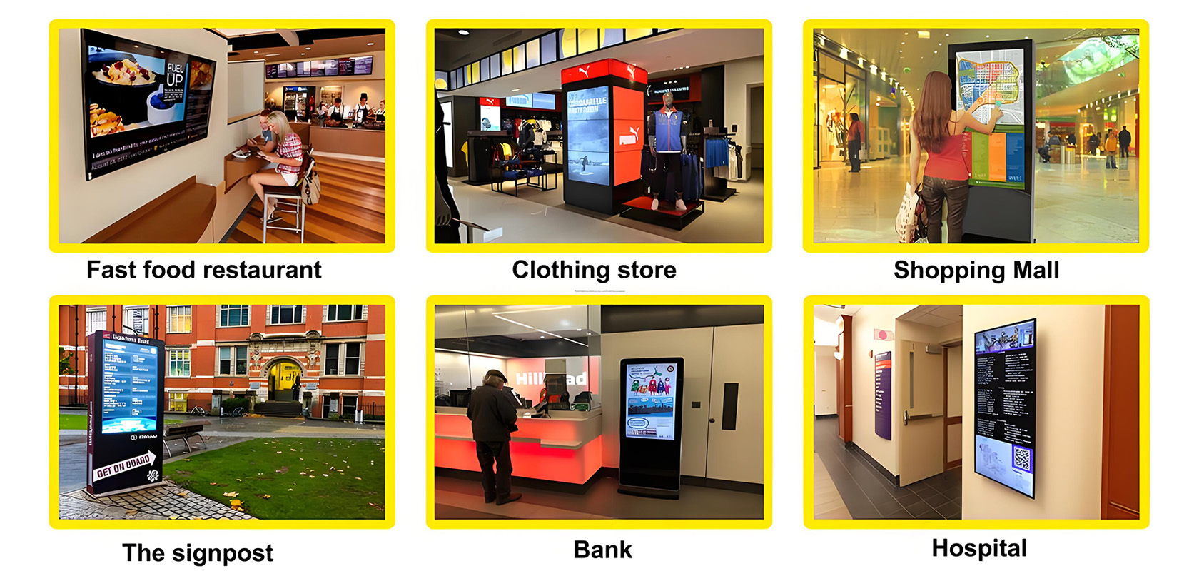
Application scenarios of digital signage


