How to Create Eye-Catching Digital Signage Layouts
How to Create Eye-Catching Digital Signage Layouts.Digital signage has revolutionized the way businesses communicate with their audiences, offering dynamic, engaging, and interactive displays that can captivate viewers. Whether you're designing digital signage for a retail store, corporate office, restaurant, or public space, creating an eye-catching layout is crucial to ensuring your message is effectively delivered. In this article, we'll explore the key elements and best practices for designing impactful digital signage layouts that grab attention and leave a lasting impression.

Understand Your Audience
Before diving into the design process, it's essential to understand your target audience. Knowing who you're designing for will inform every aspect of your layout, from color choices to content placement. Consider the following:
Demographics: Age, gender, income level, and education can all impact design preferences.
Location: The context in which the digital signage will be viewed (e.g., a busy mall vs. a corporate lobby) can influence design choices.
Objectives: Determine what you want to achieve with your digital signage. Are you aiming to inform, promote, entertain, or a combination of these?
By gaining a deep understanding of your audience, you can tailor your design to resonate with them, increasing the effectiveness of your digital signage.
Key Design Elements
1. Contrast and Color
Using high contrast between text and background ensures that your message is readable from a distance. Opt for bold, vibrant colors to attract attention, but be mindful of not overwhelming the viewer. Use color psychology to your advantage:
Red: Grabs attention and creates a sense of urgency.
Blue: Conveys trust and professionalism.
Yellow: Bright and cheerful, good for highlighting important information.
Green: Associated with growth and harmony.
2. Typography
Choosing the right fonts is critical for readability and overall aesthetic. Sans-serif fonts are generally easier to read on digital screens, especially from a distance. Avoid using too many different fonts; stick to two or three to maintain a cohesive look.
Headlines: Use large, bold fonts to grab attention.
Body Text: Choose a readable, medium-sized font for content.
Callouts: Highlight key information with contrasting colors and fonts.
3. Imagery and Graphics
High-quality images and graphics can significantly enhance the visual appeal of your digital signage. Use images that are relevant to your message and that resonate with your audience. Avoid cluttering your layout with too many visuals; instead, focus on a few impactful elements that draw the eye and support your content.
4. Whitespace
Don't underestimate the power of whitespace. It helps to declutter your layout, making it easier for viewers to focus on key information. A balanced layout with adequate whitespace ensures that your content is clear and easy to digest.
5. Consistency
Maintain a consistent design language across all your digital signage layouts. This includes using a consistent color scheme, font styles, and imagery. Consistency helps to reinforce your brand identity and makes your signage more recognizable.
Best Practices for Digital Signage Layouts
1. Keep It Simple
Less is more when it comes to digital signage. Avoid overwhelming your audience with too much information. Focus on delivering a single, clear message that can be quickly understood. Use bullet points, short sentences, and concise headlines to convey your message effectively.
2. Use Hierarchy
Establish a clear visual hierarchy to guide viewers through your content. This can be achieved through the use of size, color, and placement. Prioritize important information by making it larger or using a contrasting color. Use secondary elements to support your main message without detracting from it.
3. Design for Readability
Ensure that your text is readable from a distance and in various lighting conditions. Use high-contrast colors, large fonts, and sufficient spacing between lines of text. Avoid using light colors on a light background or dark colors on a dark background. Consider the viewing angle and distance when designing your layout to ensure that it's easily readable from all areas.
4. Incorporate Movement
Digital signage allows for dynamic content, so take advantage of this by incorporating movement. Use animations, transitions, and scrolling text to capture attention and convey information in a engaging way. However, be mindful of not overusing movement, as it can become distracting and overwhelming.
5. Use Templates
Designing from scratch can be time-consuming and challenging. Use pre-designed templates as a starting point to ensure a professional and cohesive look. Many digital signage software platforms offer customizable templates that can be tailored to fit your brand and messaging.
6. Test and Iterate
Before deploying your digital signage, test it in real-world conditions to ensure that it works as intended. Check for readability, visibility, and overall effectiveness. Gather feedback from your audience and use it to iterate and improve your design. Continuously refining your layouts based on performance data and viewer feedback will lead to more effective digital signage.
Tools and Software for Digital Signage Design
To create eye-catching digital signage layouts, you'll need the right tools and software. Here are some popular options:
1. Canva
Canva is a versatile design tool suitable for beginners and professionals alike. It offers a wide range of templates, design elements, and fonts to help you create stunning digital signage layouts. Canva's drag-and-drop interface makes it easy to customize your designs without any design experience.
2. Adobe Creative Suite
For more advanced users, Adobe Creative Suite (specifically Adobe Illustrator and Photoshop) offers powerful design tools for creating custom digital signage layouts. These tools allow for intricate design work, including vector graphics, image editing, and typography.
3. Figma
Figma is a web-based design tool that's ideal for collaboration. It offers a range of features for designing digital signage, including vector editing, prototyping, and real-time collaboration. Figma's interface is intuitive and user-friendly, making it a popular choice for design teams.
4. Digital Signage Software
Once your layouts are designed, you'll need software to display them on your digital signage. Popular options include:
Rise Vision: Offers a user-friendly interface for designing, scheduling, and displaying digital signage content.
ScreenCloud: Provides an easy-to-use platform for managing and displaying digital signage across multiple screens.
BrightSign: A comprehensive digital signage platform that supports 4K video playback and offers a range of customizable templates.
Conclusion
Creating eye-catching digital signage layouts requires a combination of design know-how, an understanding of your audience, and the right tools. By focusing on key design elements like contrast, color, typography, and imagery, and following best practices for readability and engagement, you can design digital signage that effectively communicates your message and captivates your audience. Remember to test and iterate your designs based on feedback and performance data to ensure they're as effective as possible. With the right approach, your digital signage can become a powerful tool for engaging and informing your audience.
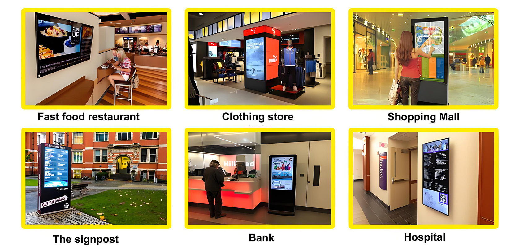
Application scenarios of digital signage


