The Role of Typography in Digital Signage Design
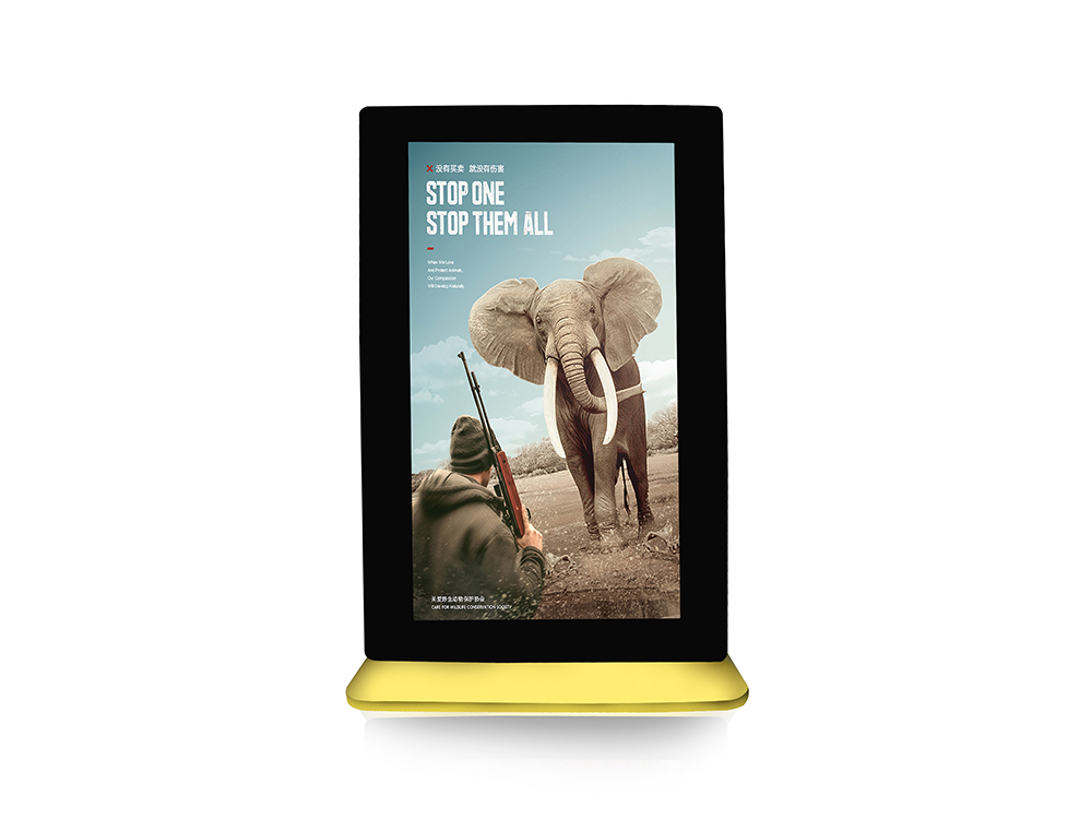
The Role of Typography in Digital Signage Design.In the realm of digital signage, where information is conveyed in a fleeting glance, typography plays a pivotal role. It is not merely a means of displaying text but an essential element that can significantly enhance or detract from the overall effectiveness of the message. Digital signage, encompassing a wide range of displays from LED screens in urban landscapes to interactive kiosks in shopping malls, relies heavily on typography to capture attention, communicate clearly, and evoke the desired emotional response from viewers. This article delves into the intricacies of typography in digital signage design, exploring its fundamental principles, the impact of different typefaces, and best practices for leveraging typography to create compelling and effective digital signs.

Understanding the Basics of Typography
Typography, at its core, is the art and technique of arranging type to make written language legible, readable, and appealing when displayed. In digital signage, this involves selecting appropriate fonts, sizes, weights, and styles that harmonize with the content, context, and intended audience. The choice of typography can influence how quickly information is processed, how long it is retained, and ultimately, how the brand or message is perceived.
The Power of Readability
Readability is paramount in digital signage design. With limited time and attention spans, viewers must be able to quickly grasp the main points of the message. This necessitates the use of typefaces that are clean, simple, and easy to read at varying distances and under different lighting conditions. Sans-serif fonts, such as Arial, Helvetica, or Futura, are often preferred for digital displays due to their clarity and lack of distracting embellishments. These fonts tend to have more open counterforms (the negative spaces within letters), which aid in legibility, especially in smaller sizes or when viewed from afar.
However, readability should not be confused with uniformity. While consistency in typography across a brand’s digital signage is important for maintaining a cohesive identity, variety can be introduced through careful selection of complementary fonts for headers, subheaders, and body text. This hierarchy of type helps guide the viewer’s eye and prioritizes information, making it easier to navigate complex messages.
Emotional Resonance and Brand Identity
Typography is not just about functionality; it also plays a crucial role in shaping the emotional tone and brand identity of digital signage. Different typefaces convey distinct personalities and can evoke specific emotions. For instance, serif fonts like Times New Roman or Garamond are often associated with tradition, elegance, and authority, making them suitable for high-end retail stores or museums. On the other hand, more playful and modern sans-serif fonts, such as Comic Sans or Google’s Product Sans, can create a sense of fun and approachability, ideal for children’s brands or casual dining establishments.
In addition to font choice, the use of color, weight, and style can further enhance the emotional impact of typography. Bold, contrasting colors can attract attention and emphasize important information, while softer hues may be used to create a calming or sophisticated atmosphere. Similarly, varying the weight of fonts (light, regular, bold, black) can add depth and emphasis, guiding the viewer’s focus and reinforcing the message hierarchy.
Adaptability to Context and Environment
Digital signage exists in a diverse array of environments, each with its own unique set of challenges and opportunities. Typography must be adaptable to these contexts, ensuring that messages are effectively communicated regardless of the surroundings. For outdoor digital signs, factors such as sunlight glare, weather conditions, and viewer distance must be considered. High-contrast, bold typefaces with generous leading (space between lines) and kerning (space between letters) are essential to ensure readability in bright daylight or adverse weather.
Indoor digital signage, particularly in busy environments like shopping malls or airports, faces different challenges. Here, the goal is to capture attention amidst a sea of visual stimuli. Large, eye-catching fonts, dynamic animations, and color contrasts that stand out from the surrounding environment can be effective. However, it is crucial to strike a balance between being noticeable and avoiding visual clutter that might overwhelm or confuse viewers.
Interactivity and User Experience
As digital signage evolves, interactivity becomes a key feature in many designs. Typography plays a vital role in enhancing the user experience of interactive displays. Clear, intuitive navigation menus with easily readable fonts ensure that users can quickly understand how to interact with the signage. Touch-friendly interfaces often benefit from larger tap targets and clear visual feedback, such as color changes or animations, to indicate interactivity.
Moreover, responsive typography that adapts to different screen sizes and orientations is crucial for maintaining usability across devices. With the rise of mobile devices and varying screen resolutions, it is essential to design typography that remains legible and effective on small screens without compromising the overall design aesthetic.
Accessibility and Inclusivity
Inclusivity and accessibility are increasingly important considerations in digital signage design. Typography must be chosen with care to ensure that messages are comprehensible to all viewers, including those with visual impairments or cognitive disabilities. High-contrast color schemes, large font sizes, and simple, easy-to-read typefaces are essential for accessibility. Additionally, the use of dyslexie-friendly fonts, which are designed to reduce reading difficulties for individuals with dyslexia, can further enhance inclusivity.
It is also crucial to consider cultural and linguistic differences when designing typography for international audiences. Choosing fonts that are widely recognized and legible across different languages and cultures can help ensure that messages are effectively communicated without unintended misinterpretations.
Best Practices for Typography in Digital Signage
To create compelling and effective digital signage, designers should follow these best practices for typography:
Prioritize Readability: Choose clean, simple fonts that are easy to read at varying distances and under different lighting conditions.
Establish a Hierarchy: Use a clear hierarchy of type to guide the viewer’s eye and prioritize information.
Align with Brand Identity: Select typefaces that reflect the brand’s personality and tone, while ensuring consistency across all digital signage.
Adapt to Context: Consider the environmental factors and viewer behavior when choosing typography for different settings.
Enhance Interactivity: Use clear, intuitive fonts for navigation and ensure that typography adapts to different screen sizes and orientations.
Focus on Accessibility: Design typography that is inclusive and accessible to all viewers, including those with visual or cognitive impairments.
Test and Iterate: Continuously test and refine typography choices based on user feedback and analytics to optimize the effectiveness of digital signage.
Conclusion
Typography is a fundamental aspect of digital signage design, influencing readability, emotional resonance, brand identity, and overall user experience. By carefully selecting and arranging typefaces, designers can create compelling, effective, and accessible digital signs that capture attention, communicate clearly, and evoke the desired response from viewers. As digital signage continues to evolve, the strategic use of typography will remain a critical factor in its success, enabling brands to connect with audiences in meaningful and impactful ways.
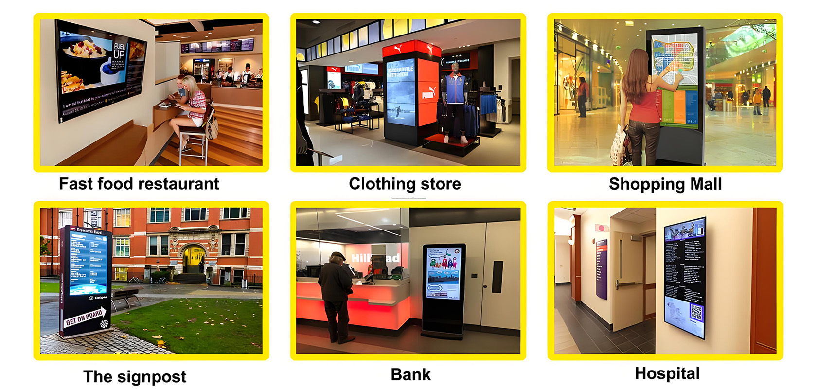
Application scenarios of digital signage


