The Role of Color in Digital Signage Design
The Role of Color in Digital Signage Design.In the realm of digital signage design, color plays an indispensable role. It transcends mere aesthetics, serving as a powerful tool to capture attention, evoke emotions, convey messages, and enhance overall user experience. Digital signage, encompassing a wide array of displays such as LED screens, LCD panels, and projection systems, has become ubiquitous in various settings including retail stores, corporate offices, transportation hubs, and public spaces. The strategic use of color in these digital displays can significantly impact how information is perceived and responded to by viewers.

The Psychology of Color
Before delving into the specific applications of color in digital signage design, it is crucial to understand the psychology of color. Colors possess intrinsic properties that evoke specific emotional responses and associations in humans. For instance, red is often perceived as energetic, exciting, and urgent, while blue conveys trust, calmness, and professionalism. Green signifies growth, harmony, and safety, while yellow stimulates creativity, happiness, and attention.
These color associations are not arbitrary but are rooted in cultural, psychological, and physiological factors. Therefore, understanding how different colors are perceived across diverse demographics is essential for creating effective digital signage. By tapping into these psychological responses, designers can intentionally manipulate viewer emotions and behaviors, guiding them towards desired actions or outcomes.
Attention and Visibility
One of the primary roles of color in digital signage design is to capture attention. In an environment饱和 with visual stimuli, standing out can be challenging. Bright, contrasting colors are particularly effective in drawing the eye to specific elements within a digital display. For example, using a bright red button or highlight against a neutral background can ensure that it is promptly noticed and recognized as an actionable item.
Moreover, the use of high-contrast color combinations can enhance readability and visibility, particularly in environments with varying lighting conditions. This is crucial for ensuring that critical information is conveyed clearly and efficiently. For instance, in a retail setting, highlighting promotional items with contrasting colors can make them more visible and enticing to potential customers.
Emotional Impact and Branding
Color also plays a pivotal role in evoking emotional responses and enhancing branding. Consistent use of brand colors in digital signage can foster a sense of recognition and loyalty. When customers see familiar color schemes, they are more likely to associate the displayed content with the brand, thereby strengthening the brand identity.
Different colors can evoke distinct emotions, which can be leveraged to align with the desired tone and messaging of the digital signage. For example, a restaurant promoting a new healthy menu might use green hues to evoke feelings of freshness and well-being. Conversely, a sports arena might employ vibrant reds and blues to create an energetic and exciting atmosphere.
Hierarchy and Organization
Effective digital signage design often involves presenting a lot of information within a limited space. Color can serve as a powerful tool to establish hierarchy and organize content in a way that is easy to navigate and comprehend. By using a color palette that distinguishes different types of information, designers can guide viewers' eyes through the content in a logical and intuitive manner.
For instance, headings and subheadings can be in bold, contrasting colors to make them stand out, while body text and secondary information can be in more subdued tones. This not only enhances readability but also helps viewers quickly grasp the main points without feeling overwhelmed.
Cultural Sensitivity
While colors have universal associations, their meanings and connotations can vary across different cultures. Therefore, it is crucial for digital signage designers to consider cultural sensitivities when selecting colors. For example, white is often associated with purity and peace in Western cultures, but in some Eastern cultures, it is linked with mourning and death.
Similarly, the use of red in digital signage might be effective in attracting attention in many cultures, but it can have negative connotations in some Asian countries, where it is sometimes associated with danger and aggression. By researching and understanding cultural nuances, designers can avoid potential misinterpretations and ensure that their digital signage resonates positively with diverse audiences.
Seasonal and Event-Driven Adjustments
Color can also be used to create seasonal or event-driven themes in digital signage. This not only adds a sense of relevance and timeliness to the content but also enhances engagement and interest. For example, during the holiday season, using festive colors such as red, green, and gold can create a joyful and festive atmosphere.
Similarly, digital signage for a summer sale event might incorporate bright, cheerful colors like yellow and orange to evoke feelings of warmth and excitement. By aligning the color scheme with the seasonal or event theme, designers can create a cohesive and immersive experience that resonates with viewers.
Accessibility and Inclusivity
In the context of accessibility and inclusivity, color choices in digital signage design must be carefully considered to ensure that the content is readable and understandable by all viewers, including those with visual impairments. High-contrast color combinations are crucial for making text and images accessible to individuals with low vision or color blindness.
Moreover, designers should avoid relying solely on color to convey critical information, as this can be problematic for individuals who are colorblind. Instead, they should use a combination of text, shapes, and patterns to ensure that information is communicated effectively across all demographics.
Trends and Innovations
As with any design element, color trends in digital signage evolve over time. Keeping abreast of these trends can help designers create fresh, modern, and engaging content. For example, the rise of minimalist design has led to an increased use of muted, pastel colors in digital signage, creating a serene and calming atmosphere.
Innovations in display technology also present new opportunities for using color in digital signage. High-dynamic-range (HDR) displays, for instance, offer a wider color gamut and higher contrast ratios, enabling designers to create more vibrant and realistic images. Similarly, advancements in OLED and quantum dot technology are enabling more accurate and lifelike color reproduction.
Best Practices for Using Color in Digital Signage Design
Consistency: Maintain a consistent color palette throughout the digital signage to create a cohesive and recognizable brand identity.
Contrast: Use high-contrast color combinations to enhance readability and visibility, particularly in environments with varying lighting conditions.
Harmony: Ensure that the color scheme is harmonious and aesthetically pleasing to avoid overwhelming or offending viewers.
Relevance: Align the color scheme with the seasonal or event theme to create a cohesive and immersive experience.
Accessibility: Design with accessibility in mind, using high-contrast colors and avoiding reliance on color alone to convey critical information.
Testing: Test the digital signage in various environments and lighting conditions to ensure that the color scheme remains effective and readable.
Conclusion
Color is a potent tool in the digital signage designer's arsenal. By understanding the psychology of color, considering cultural sensitivities, and adhering to best practices, designers can create engaging, effective, and accessible digital signage that captures attention, evokes emotions, and conveys messages with impact.
As technology continues to evolve and color trends shift, designers must stay informed and adaptable to create digital signage that resonates with viewers and achieves the desired outcomes. By harnessing the power of color, digital signage can become a dynamic and influential medium for communication and branding in the modern world.
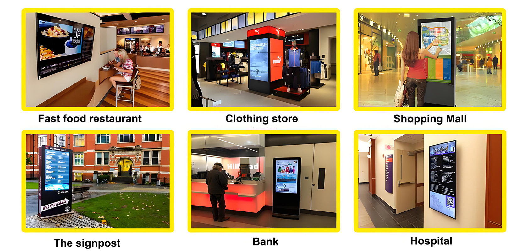
Application scenarios of digital signage