Designing Eye-Catching Digital Signage Layouts
Designing Eye-Catching Digital Signage Layouts.In the realm of visual communication, digital signage has emerged as a powerful tool for businesses to captivate audiences, convey messages effectively, and enhance brand visibility. With advancements in technology, digital signage has transcended traditional static displays, evolving into dynamic, interactive platforms that engage viewers on multiple levels. Designing eye-catching digital signage layouts is crucial to maximizing this potential, ensuring that your content not only stands out but also resonates with your target audience. This article delves into the key principles and strategies for creating compelling digital signage layouts that leave a lasting impression.

Understanding Your Audience
The first step in designing effective digital signage is understanding your audience. Who are they? What are their interests, needs, and behaviors? This knowledge will inform every aspect of your design, from color choices to content placement. For instance, a vibrant, youth-oriented retail store might opt for bold colors and dynamic animations, whereas a corporate environment may prefer a more subtle, professional aesthetic.
Conduct market research, analyze customer demographics, and consider the context in which your digital signage will be viewed. Is it a busy shopping mall where attention is fleeting, or a quiet waiting area where viewers might linger longer? Tailoring your design to the specific environment and audience ensures that your message is received and processed effectively.
Choosing the Right Colors
Color plays a pivotal role in attracting attention and setting the tone for your digital signage. Use a color scheme that aligns with your brand identity and resonates with your audience. High-contrast colors, such as blue and orange or yellow and purple, can create a striking visual impact, drawing eyes to your display. However, be cautious not to overwhelm with too many bright or clashing colors, which can be distracting and difficult to read.
Consider the psychological effects of color as well. For example, blue is often associated with trust and calmness, making it suitable for financial institutions or healthcare settings. Red, on the other hand, evokes energy and urgency, ideal for promoting sales or limited-time offers. Use color strategically to evoke the desired emotional response and reinforce your message.
Clear and Concise Content
In the world of digital signage, less is often more. Viewers have short attention spans, so it’s essential to communicate your message quickly and effectively. Keep text concise, using short, punchy sentences or bullet points. Use a large, readable font that is easy to digest at a glance. Sans-serif fonts like Arial or Helvetica are generally more legible on digital screens.
Visuals are equally important. High-quality images and videos can convey information more efficiently than text alone. Use visuals that are relevant to your message and that resonate with your audience. Avoid cluttered designs; instead, focus on a single, clear call-to-action (CTA) that directs viewers what to do next, whether it’s visiting a website, making a purchase, or scanning a QR code.
Effective Layout and Composition
A well-balanced layout is crucial for creating an aesthetically pleasing and functional digital signage design. Use the rule of thirds to guide the placement of your elements, dividing your screen into nine equal parts with two horizontal and two vertical lines. Position key elements along these lines or at their intersections to create a visually appealing composition.
Maintain a clear hierarchy of information, ensuring that the most important elements are the most prominent. This can be achieved through size, color, and positioning. For example, your headline should be the largest and most eye-catching element, followed by supporting text and visuals. Use white space strategically to avoid overcrowding and to direct the viewer’s focus to the essential elements.
Dynamic and Interactive Elements
One of the key advantages of digital signage is its ability to incorporate dynamic and interactive elements. Animations, transitions, and video content can capture attention and make your message more engaging. However, it’s important to use these features judiciously. Overusing animations can be distracting and detract from your core message.
Interactive elements, such as touchscreens, QR codes, and motion sensors, can further enhance user engagement. They allow viewers to interact with your content, making the experience more memorable and personalized. For instance, a touchscreen kiosk in a retail store can enable customers to browse products, watch demos, or even make purchases directly.
Consistency with Brand Identity
Your digital signage should be an extension of your brand identity. Consistency in design elements such as colors, fonts, and imagery helps to reinforce brand recognition and build trust with your audience. Ensure that your digital signage aligns with your overall marketing strategy and complements other branding materials, such as your website, social media, and printed collateral.
Incorporate your brand’s logo prominently, but avoid cluttering the screen with excessive branding. The goal is to create a cohesive and professional look that reinforces your brand’s values and messaging without overwhelming the viewer.
Accessibility and Inclusivity
Designing for accessibility ensures that your digital signage can be enjoyed by all, including those with visual, auditory, or motor impairments. Use high-contrast colors and large fonts to aid readability. Consider adding closed captions or text overlays to video content for those who are hard of hearing. Ensure that interactive elements are easy to navigate, with clear instructions and feedback.
Inclusivity is also important. Your digital signage should reflect and respect the diversity of your audience. Use culturally sensitive imagery and language that avoids stereotypes and biases. By designing with accessibility and inclusivity in mind, you not only comply with legal requirements but also demonstrate your commitment to serving all customers equally.
Testing and Optimization
Once your digital signage design is complete, it’s crucial to test it in real-world conditions. Monitor viewer engagement and gather feedback to identify areas for improvement. Use analytics tools to track metrics such as viewership, interaction rates, and conversion rates. This data can inform future design iterations, helping you to refine your content and layout for even greater impact.
Be prepared to adapt your digital signage over time. Seasonal promotions, new product launches, and changes in consumer behavior may require updates to your content and design. Regularly reviewing and refreshing your digital signage ensures that it remains relevant, engaging, and effective.
Conclusion
Designing eye-catching digital signage layouts is a blend of art and science, requiring a deep understanding of your audience, careful consideration of design principles, and a commitment to ongoing optimization. By following the strategies outlined in this article, you can create digital signage that not only captures attention but also drives meaningful engagement and results. Remember, the key to successful digital signage is to balance creativity with clarity, ensuring that your message is delivered effectively and resonates with your target audience. With the right approach, digital signage can become a powerful tool in your visual communication arsenal, helping to elevate your brand and connect with customers in meaningful ways.
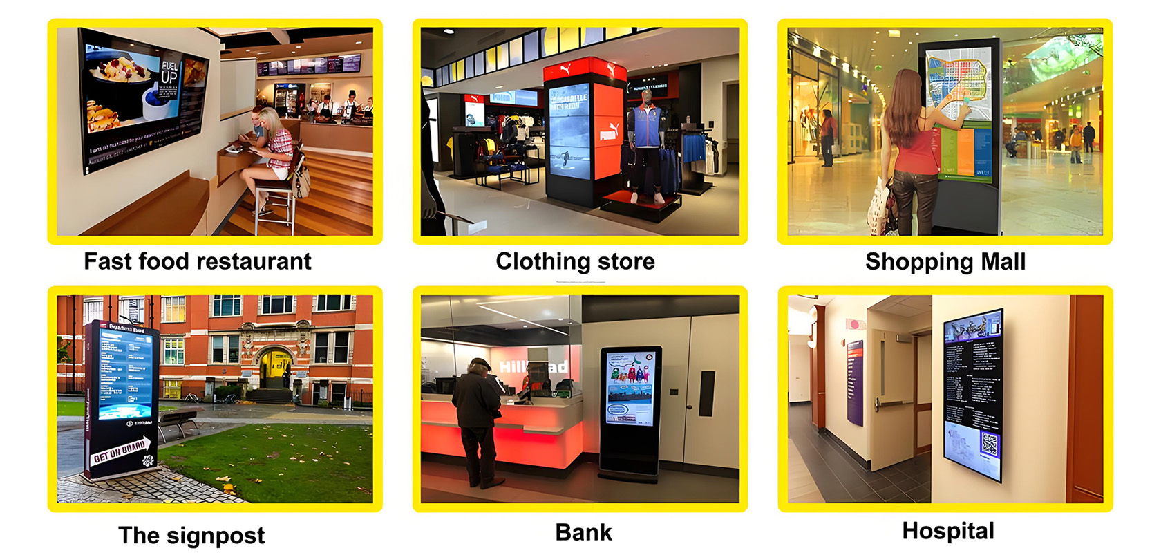
Application scenarios of digital signage

Tags:
self service kiosk touch kiosk digital signage interactive display interactive touch whiteboard kiosk video wall wall outdoor kiosk IP68 IP67 screen Shopping MallCurrent article link:
https://www.lcdkiosk.com/news/140.html


