Optimizing Digital Signage for Different Screen Sizes
Optimizing Digital Signage for Different Screen Sizes.In the rapidly evolving landscape of digital communication, digital signage has emerged as a powerful tool for businesses to engage with their audiences. From retail stores to corporate lobbies, airports to healthcare facilities, digital signage captivates viewers with dynamic content that informs, entertains, and influences behavior. However, the effectiveness of digital signage hinges on more than just compelling content; it also depends on how well that content is optimized for the variety of screen sizes and resolutions available today.

With the proliferation of smart devices, from smartphones with tiny displays to massive outdoor LED screens, creating content that looks great across all these platforms is a significant challenge. This article explores the strategies and best practices for optimizing digital signage for different screen sizes, ensuring that your message reaches its audience with maximum impact.
Understanding Screen Sizes and Resolutions
Before diving into optimization strategies, it's crucial to grasp the basics of screen sizes and resolutions. Screen size refers to the physical dimensions of the display, usually measured diagonally in inches. Resolution, on the other hand, is the number of pixels that make up the screen, expressed as width x height (e.g., 1920x1080).
Digital signage can be broadly categorized into a few key size ranges:
Small Screens: These include smartphones, tablets, and small digital displays commonly found in elevators or on countertops.
Medium Screens: Typical for indoor digital signage, such as those in retail stores, restaurants, and corporate environments. These screens might range from 32 to 65 inches.
Large Screens: Often used for outdoor advertising, event venues, and public spaces, these screens can be as large as 100 inches or more.
Each screen size presents unique challenges and opportunities for content creators. Small screens demand concise, high-impact content, while large screens can accommodate more detailed visuals and text.
Design Principles for Various Screen Sizes
Keep It Simple for Small Screens
When designing for small screens, simplicity is key. With limited space and high pixel density, intricate designs can become cluttered and difficult to read. Focus on delivering a single, clear message with high-contrast elements that draw immediate attention. Use large fonts and minimal graphics to ensure legibility.
Consider the user’s context as well. Small screens are often viewed in close proximity, so content should be easily digestible at arm’s length. Short, punchy headlines and bold images work best. Additionally, optimize for portrait or landscape orientation based on the typical usage scenario.
Enhance Visual Impact for Medium Screens
Medium screens offer more room to play with visuals and text. Use this opportunity to create engaging layouts that combine images, videos, and text effectively. Maintain a balance between visual appeal and information density. Ensure that text is still readable from a reasonable viewing distance, typically around 3-5 feet for indoor signage.
Incorporate interactive elements if applicable, such as touchscreens or QR codes that link to additional content. This can enhance user engagement and provide a more immersive experience.
Make a Statement with Large Screens
Large screens are meant to grab attention from afar. Use high-resolution images and videos that are scaled appropriately to fill the screen without losing quality. Text should be large enough to read from a distance, often requiring font sizes of 48pt or higher. Consider the viewing angle and ensure that content is visible from all parts of the intended viewing area.
For outdoor screens, factor in environmental conditions like sunlight and weather, which can affect visibility. High brightness levels and anti-glare technologies can help maintain clarity.
Technical Considerations
Responsive Design
Just as websites have adapted to responsive design to accommodate various device sizes, digital signage content should be designed to scale. Use scalable vector graphics (SVG) for icons and illustrations, and ensure that images and videos are high-resolution enough to be cropped or resized without losing quality.
Implement dynamic layout adjustments that automatically reformat content based on screen size. For example, a multi-column layout on a large screen might switch to a single-column layout on a smaller screen.
Aspect Ratio Management
Different screens come with different aspect ratios (the ratio of width to height). Common aspect ratios include 16:9, 4:3, and even ultra-wide formats like 21:9. Design your content to be adaptable to multiple aspect ratios without significant loss of information or visual appeal.
One approach is to create content with a safe zone—an area within the frame that is guaranteed to be visible on all screen sizes and aspect ratios. Important information and key visuals should be placed within this safe zone.
Resolution Optimization
Higher resolutions offer more detail but also require larger file sizes, which can impact loading times and performance. Optimize images and videos for the specific resolution of the target screen. For example, 4K content is ideal for large, high-resolution screens, but may be overkill for smaller displays.
Use compression techniques and formats that maintain quality while reducing file size, such as JPEG 2000 for images and H.264 or H.265 (HEVC) for videos.
Content Management Systems (CMS)
A robust CMS can simplify the process of managing and deploying content across different screen sizes. Look for a CMS that supports responsive design, dynamic layout adjustments, and easy updates. This allows you to create and schedule content once, then automatically adapt it for various screens.
Testing and Iteration
Preview and Test
Before deploying content, preview it on actual devices or simulators that represent the range of screen sizes and resolutions you’re targeting. This will help you identify any issues with layout, readability, or performance.
Pay attention to details like text wrapping, image scaling, and video playback. Make adjustments based on your findings to ensure a seamless experience across all screens.
Gather Feedback
Once your digital signage is live, gather feedback from viewers and stakeholders. Use this feedback to refine your content and optimize it further for different screen sizes. Look for patterns in the feedback to identify common issues or areas for improvement.
Continuous Improvement
Digital signage is a dynamic medium, and your content should evolve along with it. Regularly review and update your content to keep it fresh and engaging. Stay abreast of new technologies and design trends that can enhance the viewing experience.
Conclusion
Optimizing digital signage for different screen sizes is a complex task that requires careful planning, creative design, and technical expertise. By understanding the unique challenges and opportunities presented by each screen size, and by following best practices for design, technical implementation, and testing, you can create content that resonates with your audience regardless of where or how they view it.
Remember, the goal of digital signage is to captivate, inform, and inspire. By ensuring that your content looks great on every screen, you’ll maximize its impact and drive meaningful engagement with your audience. As technology continues to advance, stay agile and adaptable, ready to embrace new screen sizes and resolutions that will further enhance the power of digital signage.
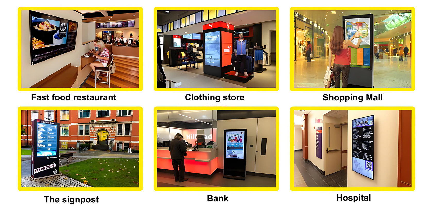
Application scenarios of digital signage

Tags:
self service kiosk touch kiosk digital signage interactive display interactive touch whiteboard kiosk video wall wall outdoor kiosk IP68 IP67 screen Shopping MallCurrent article link:
https://www.lcdkiosk.com/news/128.html


